Where do I start?
Info Box Block is a Kadence block allows you to style content and/or images in a box. Instructions and demonstrations can be found at their website.
NOTE: On 3/10/2023, the Kadence Block update changed the hover effects on the Info Box. Please review the third video down in the Instructions link to learn how to change the border around the Info Box when the cursor hovers over the Info Box. If you do not want a border on hover, it will need to be set to 0.
Tips and Tricks
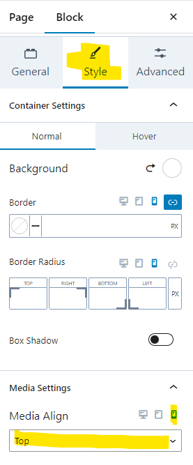
If the Info Box block is used within the Tab block, ensure that the content in the Info Box block renders correctly in mobile. There have been issues with some Info Box layouts where the image pushes the text out of the Info Box and the Tab. The best way to fix this issue in mobile view is to ensure that the alignment of the image for the Info Box is set to “Top”. To do this, click on the Style Tab for the Info Box block. Below is the screenshot of the settings to move the image to top of the Info Box in mobile view:

Accessibility Tips
- Color Contrast will not be an issue with this block as the color options are locked down – the color options found on the referenced website are not available.
- Please ensure that the text font size is at least 16px for accessibility purposes.
Disclaimer
As a public university it is crucial to ensure our information is accessible to everyone that visits our websites. To assist content owners in this effort, UTIA has created certain boundaries within the UTIA WordPress environment. These boundaries are designed to help content owners from inadvertently violating established accessibility standards. Therefore, instructions at external websites may show features that we have disabled.