As of 5/20/2025, an update was made to the UTIA Button block to decrease the amount of spacing around the block. If spacing needs to be readded around the UTIA Button block, refer to Using Additional CSS Class(es) to learn how to add spacing around the block.
1 – Where Do I Start?
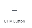
Click on the UTIA Button under UTIA Custom Blocks. The UTIA Button will appear on webpage with default text.
2 – Set up UTIA Button
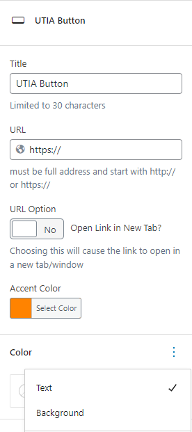
Enter a Title for the button (be sure to delete the default text) and a URL for the link, select if the link should open in a new tab and then select Accent Color for the border of button.
As of 2/9/2023, there has been some color options added to this block – the background color and the text of the UTIA Button can be changed to white (default background), slate gray (default text) or a slate gray tint. Click on the + to the right of “Color” to make these changes.
To switch between Text and Background under Color, the plus to the right of Color changes to 3 dots, click on the 3 dots to the right of Color and a box will drop down. Click on the selection that is desired.
NOTE: The Editor will look different if the background color of the UTIA Button is changed from white to one of the slate gray colors, as it extends the selected background color across the width of the page. Once the page is published, it will not look this way.

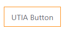
3 – Finished Product
Accessibility Tips
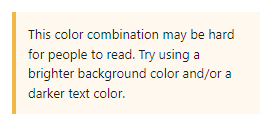
Ensure that there is enough contrast between the background and foreground colors of the UTIA button. In other words, use a white background with gray text or a gray background with white text. WordPress will tell you if there is a contrast issue with the colors chosen, if you see this message, then change the colors of the background and/or text: